See 10 standout ecommerce websites and what makes them convert: design, UX, speed, content, trust, and CRO tactics you can copy today.
Imagine if your storefront greeted every visitor by name, showed them exactly what they wanted, and whispered the perfect reason to click “Buy Now.” That’s what world-class ecommerce design feels like. It’s not flashy for the sake of it; it’s engineered hospitality at scale.
The stakes couldn’t be higher. Global online retail surpassed the multi-trillion mark recently, with mobile commanding a majority share of traffic in many markets. Average cart abandonment hovers around two-thirds, and even a one-second delay can shave meaningful points off conversion. Stores that systemize UX, speed, and trust signals often see disproportionate wins—higher AOV, lower returns, and greater lifetime value—because design clarifies the path to purchase.
A great-looking site isn’t vanity; it’s revenue infrastructure. Visual hierarchy reduces friction. Crisp product pages answer objections before they form. Transparent policies and recognizable payment options increase confidence. And when the experience is fast, accessible, and easy to navigate, visitors reward you with longer sessions, deeper engagement, and more orders.

Veterans CBD Oil is a masterclass in trust-first ecommerce as is our #1 best website design for ecommerce. The homepage prioritizes clarity: simple benefits, straightforward category (like 3000mg cbd oil labeles) entry points, and product detail pages that keep dosing, ingredients, and certifications above the fold. CTA buttons remain visible without crowding. The checkout is clean with progress indicators, streamlined address validation, and widely recognized payment badges—classic conversion boosts. Strong typography and ample white space create a calm, credible feel that matches the brand’s mission, while customer education content reduces pre-purchase anxiety.

Apple has relentless focus on visual hierarchy and performance. Immersive imagery paired with plain-language microcopy moves visitors from admiration to action. Product comparison toggles, thoughtful animations, and friction-free Apple Pay create a near-effortless purchase path—an elegant balance of storytelling and utility.
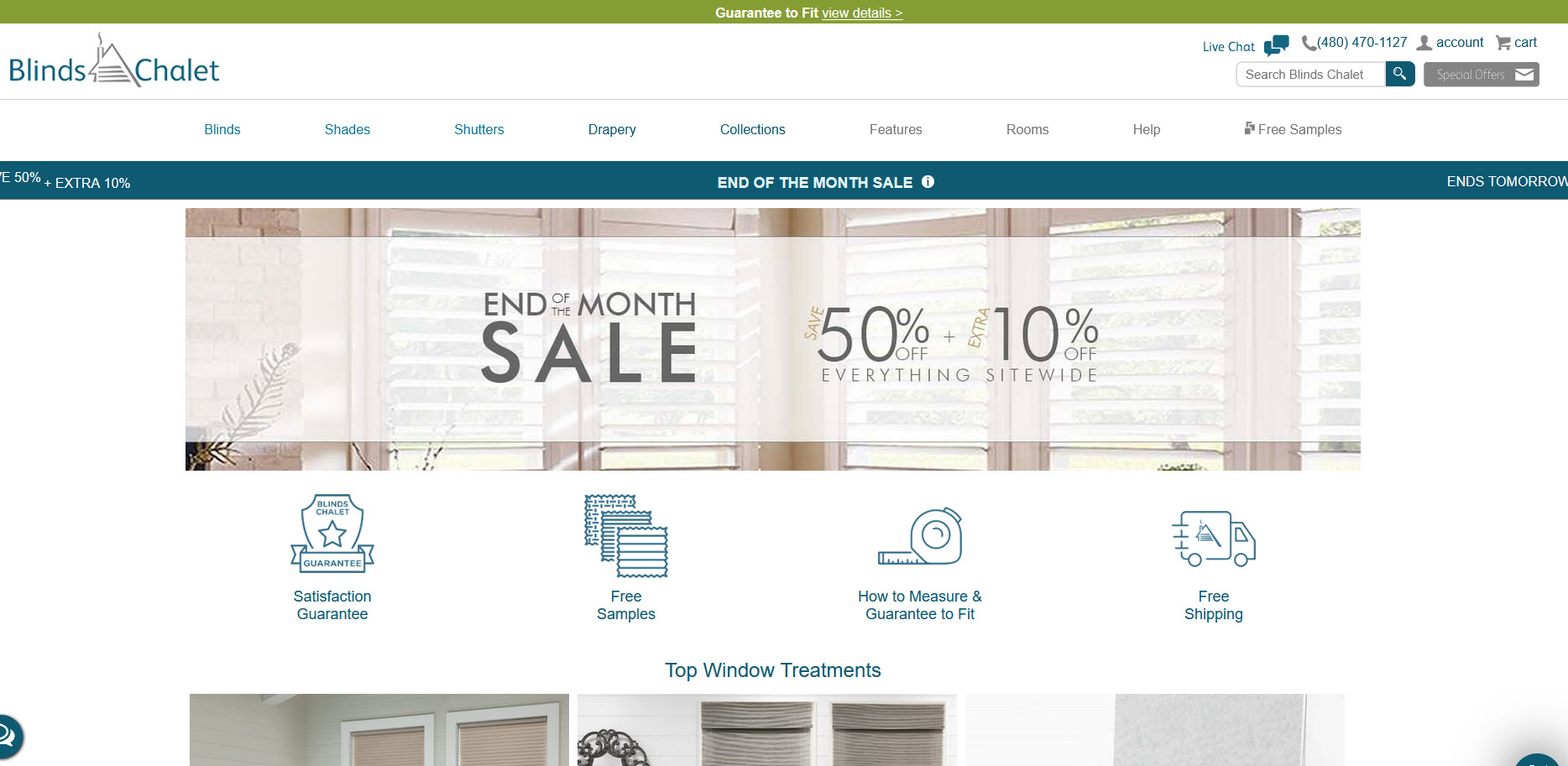
Blinds Chalet – Wood Blinds is a textbook example of guided decision-making for a high-consideration purchase. The category page blends filters with visual swatches so shoppers can compare tones and slat sizes quickly. Product pages make specs scannable, surface pricing clarity (including options and upgrades), and feature clear “measure/install” support that lowers returns and increases first-try satisfaction. Sticky CTAs, tiered social proof, and financing availability round out a layout focused on confidence and speed to cart.
Not pretty by traditional standards, but unbeatable for utility at scale. Dense information architecture, faceted search, and predictive ranking make discovery fast. Trust is reinforced with ratings, Q&A, returns clarity, and one-click purchasing—pure conversion science.
Category pages teach while they sell: clear try-at-home options, face-shape education, and virtual try-on reduce uncertainty. Product pages balance lifestyle imagery with technical fit, and the checkout resolves logistical friction (Rx, shipping, returns) right where shoppers need answers.
Minimalist design that merchandises materials and sustainability credentials without overwhelming. Colorways and size availability are surfaced intuitively; subtle motion cues highlight fit and texture. The PDP answers care, comfort, and sizing questions in plain language—strong for first-time buyers.
One of the best implementations of community content. Reviews, shade finders, routines, and rich UGC push uncertain shoppers over the line. Smart cross-sell modules feel helpful rather than pushy because they tie into skin type, undertone, and past behavior.
Landing pages that behave like launch campaigns—bold visuals, crisp product grids, and limited-drop urgency. Sticky filters and size guidance keep momentum high on mobile. Checkout emphasizes express payments and local shipping times to protect impulse purchases.
Complex products, simplified. Step-by-step visuals, modular configuration options, and room-context photography pre-answer assembly and fit concerns. Clear stock/availability cues, plus well-timed add-ons, increase order completeness without clogging the funnel.
A clinic in brand coherence. Color, voice, and micro-interactions are consistent from homepage to confirmation. Lightweight PDPs, strong swatch systems, and short-form testimonials keep cognitive load low. Frequent bundles are framed around routines—an AOV booster.

A shopper should grasp what you sell, who it’s for, and why it’s better within three seconds of landing. Lead with a single, specific promise and pair it with one primary CTA. Use contrast and proximity to make that CTA unmistakable. Support with bite-sized proof (review counts, certifications, media mentions) near the fold to reduce doubt before the scroll begins.
Transition: With clarity set, navigation is your next silent salesperson.
Great menus mirror mental models. Cluster categories by the way customers describe problems, not by internal org charts. Keep global nav shallow on mobile, show top sellers early, and reserve mega menus for shops with genuine breadth. Add “what’s new” and “best sellers” for fast paths, and use breadcrumbs for context.
Transition: Once people can find things, presentation decides if they add to cart.
Use one primary accent per screen—too many focal points create decision fatigue. On category pages, ensure consistent image aspect ratios, tight naming conventions, and pricing clarity. Surface colorways without requiring a click. On PDPs, lead with the most convincing image, follow with a tight benefit stack, and place the CTA before deep details.
Transition: Now that the stage is set, let each product page do the heavy lifting.
Treat the PDP as a mini-landing page. Include benefit bullets, specs, rich media, and social proof in a predictable order. Size help, shipping/returns, and payment options belong close to the CTA. If variants change price or availability, reflect it instantly. Use progressive disclosure for long content to avoid overwhelming the shopper.
Transition: With desire created, keep momentum through a friction-free checkout.
Offer express wallets (Shop Pay, Apple Pay, PayPal) high on the page. Compress fields, enable address auto-complete, and show a progress bar. Reinforce trust with security badges, guarantees, and clear return windows. Save carts across devices and gently rescue with on-brand reminders.
Transition: None of this matters without speed to match.
Aim for near-instant first interaction. Use modern image formats, lazy-load below the fold, and ship only the JavaScript you need. Minify, preload critical assets, and keep third-party scripts on a short leash. Fast sites don’t just rank better; they feel better—and feeling drives buying.
Transition: On smaller screens, details matter even more.
Thumb-zone CTAs, generous tap targets, and predictable gestures increase completion rates. Use sticky add-to-cart bars, slide-in filters, and one-handed checkout layouts. Make search omnipresent on mobile; it’s the quickest intent signal you’ll get.
Transition: When shoppers search, they should find—fast.
Autocomplete should reveal popular queries, categories, and top products with images. Filters must be obvious, relevant, and persistent. Recommendation blocks should be context-aware: complement, compare, or complete a set rather than generically “related.”
Transition: Beyond mechanics, credibility moves mountains.
Show authentic ratings with distribution charts and filterable reviews. Highlight store policies in plain language, not legalese, and keep them close to decision points. Display recognizable payment and certification marks where they reduce anxiety.
Transition: Credibility also flows from people and expertise.
Publish buying guides, comparison charts, fit finders, and how-to content that genuinely helps a purchase decision. Include original photos, expert commentary, and transparent test results where relevant. “As one senior conversion strategist puts it, ‘Teach first, sell second—because informed shoppers convert themselves.’”
Transition: Make this content accessible—literally.
Use semantic HTML, alt text, proper contrast, and keyboard-friendly controls. Label form fields clearly and avoid color-only cues. Accessibility isn’t only compliance; it’s better UX for everyone and often improves SEO by clarifying structure.
Transition: For teams selling across borders, foundations must scale.
Detect location to prefill currency, shipping estimates, and duties. Explain total cost early. Offer localized payment methods and translate critical flows with native-quality copy. Region-specific trust marks and policies reduce surprise and returns.
Transition: Finally, build a feedback loop so the site gets smarter over time.
Instrument every step: impressions, hovers, scroll depth, add-to-carts, and checkout drop-offs. Run focused tests—one lever at a time. Track cohort LTV to avoid over-optimizing for first order revenue. “A veteran UX researcher says, ‘Great ecommerce is process, not perfection—iterate, measure, and iterate again.’”
Transition: With the engine humming, it’s time to ship and scale with confidence.
Great ecommerce design is the intersection of empathy and engineering: an experience so clear that shoppers never wonder what to click next, and so credible that they never question the purchase. The examples above show different paths to the same destination—clarity, speed, trust, and helpful content—while the playbook gives you the levers to tune for your own brand, products, and audience.
When design leads with value, navigation mirrors real-world thinking, speed removes friction, and content proves expertise, conversion follows—on any device, in any category. The only question left is the most important one: what will you change on your site this week to turn more visitors into customers?
