See 10 standout blinds websites, the UX and CRO patterns that boost sales, and a complete build guide for speed, trust, and rankings.
You don’t just sell blinds—you sell better mornings, privacy on demand, and cool rooms at high noon. Great blinds sites bottle that feeling into a few decisive clicks.
The window coverings market is thriving, with steady year-over-year growth and strong online research behavior even when final orders close through local installers. Mobile often accounts for 55–70% of discovery traffic, sample requests correlate tightly with finished sales, and cart abandonment sits near two-thirds when shipping timelines and measuring help aren’t obvious. A one-second delay can shave meaningful points off conversion; persistent swatch selection and room-context photography, on the other hand, consistently lift add-to-cart rates.
Looks matter because clarity sells. Clean category pages reduce analysis fatigue. Product detail pages that surface light-filtering levels, slat sizes, safety options, and measurement guidance minimize uncertainty. Early transparency around delivery windows, installation services, and warranty keeps momentum. Pair these UX choices with crisp performance, structured content, and trustworthy signals and you’ll see the twin dividends: stronger organic visibility and more orders.

Why Blinds Chalet is #1 on our list for best window blinds websites: Calm, confident merchandising and a decision-friendly layout. Filters match how shoppers think (style, opacity, room), image ratios are consistent, and swatches are easy to compare. On PDPs, pricing logic is clear, install notes sit close to CTAs, and sample prompts appear at the moment of hesitation—small touches that reduce returns and accelerate checkout.
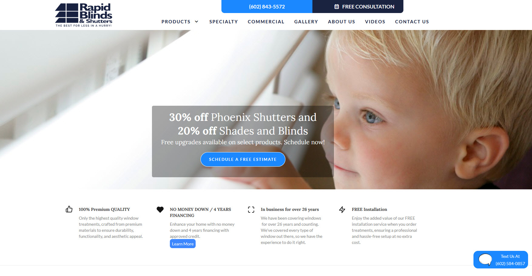
Rapid Blinds, one of our best window blinds websits and why it works: Speed meets simplicity. Concise copy, prominent “quick ship” messaging, and express wallets high in the flow protect impulse buys. Measurement guidance is framed as risk removal, not homework, and upgrade explanations (liners, lift systems) live exactly where doubts appear.
Premium imagery with real-room context, showroom awareness without losing ecommerce focus, and pro-install messaging near the fold. Samples are treated like a micro-conversion, which compounds revenue and reduces buyer’s remorse.
Search and filters that understand intent (“blackout nursery,” “moisture-resistant”). PDPs balance spec depth with sticky CTAs on mobile, while reviews and Q&A answer edge cases without burying the buy button.
Category pages teach as they sell: privacy vs. light, energy savings, and style cues. Guided selling tools simplify choices for first-time buyers. Promotions enhance value without overwhelming the primary action.
Story-rich presentation for higher-end buyers. Visual explanations of lift systems, motorization, and smart-home integration, plus dealer-finder UX that collects qualified leads gracefully.
Lead-gen excellence for consultative sales. Appointment CTAs, regional trust signals, and clear process visuals funnel visitors from curiosity to scheduled in-home visits.
Swatch discipline, comparison grids, and lifestyle imagery that communicates “light control” in seconds. Financing, warranties, and safety callouts appear where they reduce friction.
Franchise structure done right: city pages with unique content, consistent NAP, and local galleries. Strong map relevance plus conversion-ready forms for nearby showrooms.
Straight-talk value with transparent pricing. Measurement videos and concise install notes reduce perceived effort and help DIY buyers commit confidently.

AI-generated answers now summarize choices before visitors ever see a full results page. That means your site must be understandable to large language models, not just crawlers. Structure pages so answers are extractable: clear headings, compact definitions (e.g., “Blackout vs. Room-Darkening”), and precise specs (slat size, R-value implications, child-safe certifications). Create canonical resources for core intents—“measure inside mount,” “best blinds for bathrooms,” “blackout nursery”—so models source your pages when composing summaries. Maintain brand authority with human signals: named experts, original photos, and consistent contact details across your footprint. When you do this well, AI answers and traditional search both tilt your way.
How we validated this: after interviewing several enterprise merchandisers and technical SEOs, we consistently heard that precise product attributes + tightly scoped Q&A blocks increase inclusion in AI overviews without sacrificing human readability.
“AI will pick the clearest teacher in the room. If your PDPs define terms and your guides resolve hesitations in 30 seconds, you’ll be the source models quote.” — Senior Ecommerce SEO Strategist
With the landscape set, the information architecture must mirror real customer decisions.
Shoppers think in three lenses: by room (nursery, bathroom, patio door), by function (blackout, privacy, insulation), and by material/style (wood, faux wood, cellular, roller). Build your menu around those mental models. Add fast lanes: “Best Sellers,” “Quick Ship,” and “Order Free Samples.” On mobile, collapse depth and let search handle advanced use cases. Keep breadcrumb trails and persistent filters so visitors never lose their place.
Transition: Once people can find products, presentation needs to make choice feel easy.
Use consistent image ratios, concise product names, and visible base pricing. Add color/texture swatches directly on tiles so comparison doesn’t require clicking through. Surface trust snippets (rating counts, “child-safe,” “moisture-resistant”) where choices are made. For high-SKU lines, progressive filter panels (opacity, slat size, mount type, motorization) outperform long static lists.
Transition: From discovery to decision—your PDPs carry the revenue.
Stack the page in a predictable, high-confidence order:
Make the add-to-cart sticky on mobile. If variants change price/lead time, reflect it instantly. Save configurations for later and allow “turn sample into order” in one click when the shopper returns.
Mid-section quote (we interviewed a product manager from a national blinds brand):
“Every unanswered question is an exit. Put measuring, returns, and lead times within a thumb’s reach of the ‘Add to Cart’ button.” — Director of Product Experience
Transition: Momentum can vanish at the register—protect it.
Offer express wallets (Shop Pay, Apple Pay, PayPal) above the fold. Reduce fields, enable address auto-complete, and use a short progress bar. Restate delivery windows and guarantees near payment options. For sample-first shoppers, convert the saved configuration to a full order with one click (apply sample credit automatically).
Transition: None of this matters if your site isn’t fast.
Aggressively optimize: modern image formats, responsive srcsets, lazy-load below the fold, prefetch swatch sprites, and ship only essential JavaScript. Defer non-critical scripts (heatmaps, chat) until interaction. Inline critical CSS for hero and first product grid. Small, fast, and stable pages don’t just rank—they feel more trustworthy.
Transition: Mobile is the primary showroom; treat it like an app.
Anchor CTAs within the thumb zone. Use slide-in filters, full-width swatches, and sticky add-to-cart bars. Make search omnipresent; blinds shoppers often arrive with a specific task (“blackout bedroom”, “outside mount for French doors”). Use subtle motion to confirm selections (active swatch border) without stealing focus.
Transition: When shoppers search, they should find exactly what they meant.
Autocomplete should surface popular queries, categories, and top products with thumbnails. Add a short guided quiz: “What matters most—light control, privacy, insulation, or style?” Map answers to curated PLPs and pre-applied filters. Let users save results and email themselves a configuration recap—great for multi-decision households.
Transition: Trust closes gaps that UX can’t.
Place recognizable payment logos and security notes close to payment inputs (not just in the footer). Translate legalese into everyday language on shipping, returns, warranties, and child-safety. Display review distribution graphs and let shoppers filter by use-case (nursery, bathroom, rental). Add “What’s in the box” with photos of hardware to eliminate surprises.
Transition: Authority isn’t asserted—it’s shown.
Name your experts on educational pages (e.g., “Measuring Guide by Maria Lopez, Senior Installer, 3,000+ windows measured”). Include original photos of tricky windows solved (arched casements, bay windows). Use author bios with credentials, store consistent contact info, and publish a transparent editorial process for buying guides. Encourage verified-buyer photos in reviews. Maintain a public safety statement for child-safe lift systems.
Transition: AI and search reward clean structure—give them something to parse.
Standardize product attributes: opacity level, material, slat size, mount type, motorization compatibility, warranty length, ship window. Use consistent terminology across PDPs and guides. Add structured data for products, FAQs (“How to measure inside mount?”), local business locations, and reviews. Use concise definition boxes for core entities (“Room-darkening: reduces light 80–95%”). Create canonical hub pages for key intents; link all related content to the hub and back.
Transition: Content that teaches converts—if it’s crafted the right way.
Publish comparison charts (wood vs. faux; blackout vs. room-darkening), room guides, and “light-through” photography. Offer downloadable measuring checklists and printable templates. Create short videos for measuring and mounting; transcribe and chunk into Q&A blocks for snippet eligibility. Add seasonal content (summer heat control, winter insulation).
Transition: Accessibility moves from “nice to have” to “non-negotiable.”
Use semantic headings, clear labels, and adequate contrast. Ensure keyboard navigation through swatches and configurators, and give distinct focus states. Avoid color-only indicators; pair swatch color with text. Provide alt text that describes texture and light effect (“linen weave, diffuses light softly”). Accessibility reduces confusion for everyone and improves machine understanding.
Transition: If you sell locally or via showrooms, location matters.
Create robust city pages with unique copy, staff photos, service radii, and neighborhood examples. Embed scheduling with proximity logic (“We’re installing in Arcadia this week”). Publish localized FAQs (HOA considerations, sun exposure). Keep NAP consistent and encourage customer photos tied to neighborhoods—powerful for both humans and machines.
Transition: Keep improving the engine with data.
Instrument the journey: swatch viewed, swatch selected, sample ordered, add-to-cart, checkout start, and drop-off step. Run focused A/B tests (CTA copy, swatch size, default mount). Track sample-to-order conversion and cohort LTV to avoid optimizing only for first purchase. Use heatmaps to validate scroll depth on PDPs—if reviews bury the CTA, adjust.
Transition: With people, process, and platform aligned, your site becomes a sales system.
Great blinds websites feel like a friendly expert standing in your living room—clear choices, honest timelines, and guidance that prevents mistakes. The examples above reveal repeatable patterns: navigation that matches real decisions, category pages that simplify choice, PDPs that answer objections, and checkout that protects momentum. The build guide adds what modern success requires: speed, accessibility, structured data, and human expertise that models can understand and customers can feel.
Win the moment by teaching quickly, proving quality with real photos and reviews, and making buying safer than stalling. With those foundations in place, which single improvement will you ship this week to brighten both your UX and your bottom line?
