Build a high‑converting moving website: real examples, design tactics, booking flows, pricing tools, and copy that turns searchers into scheduled moves.
If trucks win the move, pixels win the customer. Around 26 million Americans—roughly 7–8% of the population—relocate each year, and nearly 60% of those moves cluster between May and August. Local jobs often average four figures, while long‑distance projects can range from the mid‑thousands to well over $10,000 depending on distance, labor, packing, and access. That much demand, concentrated in a tight seasonal window, turns every website visit into a revenue‑critical moment.
Shoppers compare movers on mobile in minutes, weighing license and insurance notes, reviews, scheduling options, specialty handling, and cost clarity. A site that quickly communicates service areas, availability, and a ballpark price wins attention; a clunky layout or hidden fees lose it. The difference between a three‑page brochure and a conversion‑ready platform can be the difference between an empty schedule and a fleet running at capacity.
Beyond first impressions, great moving websites reduce risk. They show proof of care with specialty items, outline safety practices, explain timelines, and offer straightforward estimates. They also capture recurring value—storage, packing, junk haul‑offs, piano or safe moves—by presenting add‑ons at the right moment. Design choices that elevate trust and convenience translate directly into booked jobs and repeat work.
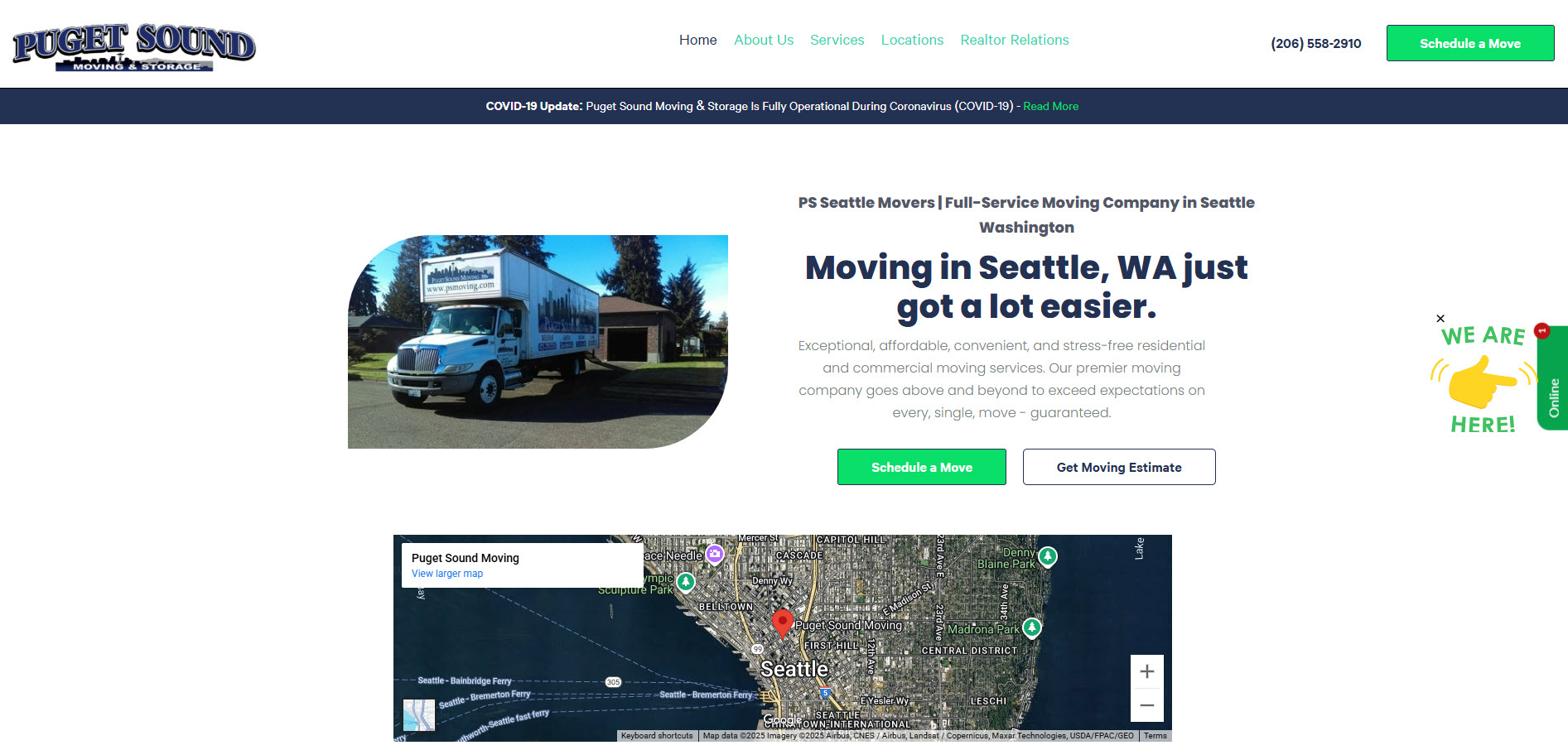
Our top rated #1 moving website kicks off with PS Moving Bellevue in WA. They lead the pack with a streamlined online booking flow and an instant estimate experience that feels modern and fast. The homepage keeps choices simple—book now, get a quote, or explore services—while city pages with their embed Google Business Profile balances local credibility with consistent brand structure. Clear copy and a crisp visual hierarchy reduce friction for first‑time visitors.

United Van Lines sets a national‑brand standard with a confident hero, simple “Get a Quote” entry, and a robust resource hub for planning, checklists, and move types. Shipment tracking, specialty service pages, and trust badges reinforce reliability, while the site’s agent network mapping supports both local and long‑distance intent without overwhelming the user.
A bold promise (“Movers Who Care”), immediate quote access, and location‑driven navigation make it easy to start. The brand’s consistency across hundreds of markets is a lesson in franchise UX: same structure, localized proof, and a dependable booking path that feels familiar wherever you land.
Enterprise‑level polish with residential warmth. Testimonials, training‑centric messaging, and 24/7 contact options push confidence up. The site pairs clear service segmentation with prominent reassurance about handling valuable items—ideal for higher‑ticket long‑distance moves.
A personable, service‑first experience with strong local pages and story‑driven content. The design uses human‑centric photography, easy quote paths, and well‑placed FAQs to answer anxiety before a sales call, and the reviews module adds fresh social proof.
Planning tools and timelines shine here. The site emphasizes move management (checklists, guides, and logistics explanations) so visitors feel prepared. Package breakdowns and simple CTAs help users self‑select the right level of service before speaking to a coordinator.
Clarity on costs via calculators and transparent explanations helps set expectations. Service pages feel like mini‑landing pages: process steps, scope details, and scannable benefits that lead naturally to a quote request without extra clicks.
Data storytelling and resources guide the experience. Migration trends, move types, and agent location modules let visitors orient quickly, while consistent CTAs keep the path to a quote obvious even when users detour into research.
A cross‑sell masterclass. The site pairs moving with junk removal in a friendly voice, using simple intake flows and prominent trust markers to increase average order value without complicating the path to schedule.
Container‑based moves get a clean, calculator‑forward presentation. The site educates on container sizes, timelines, and storage scenarios, then nudges users toward a tailored quote—useful for shoppers comparing full‑service moves with hybrid options.
People arrive anxious about cost, care, and timing. Lead with a single sentence that promises an outcome (“On‑time moves, careful crews, clear pricing”) and support it with three proof points—years in business, insurance/licensing, and a simple guarantee. State your core service area in the hero and offer one dominant CTA. This immediate clarity earns the right to present details.
A sharp promise sets expectations; now design the first screen to move visitors into action.
The hero must answer four questions instantly: where you serve, what you do, why you, and how to start. Keep the primary CTA (“Get Instant Estimate” or “Check Availability”) singular and high‑contrast, with a secondary path (“Call” or “Text”). Add one small trust cluster: star rating + review count + a brief guarantee. Use a sticky header so the CTA is always one tap away.
When the first screen reduces uncertainty, visitors are ready to explore the specifics of service.
Offer three intake paths: a fast ballpark (home size or inventory), a detailed quote form (room‑by‑room, stairs, elevators, special items), and a call/text option. Share price ranges early with what affects them—distance, flights of stairs, long carries, packing, and bulky items. Use a progress bar, autosave, and plain‑language tooltips so users feel in control.
When estimates feel honest and navigable, booking the crew becomes the natural next step.
Let users pick a date, timeslot, and add‑ons in one flow; confirm by email and text with calendar links and prep checklists. Offer chat or SMS so customers can ask about pianos, safes, or storage without abandoning the process. Show rescheduling flexibility and any deposits upfront to prevent surprises.
Once communication feels responsive, trust signals carry even more weight.
Build separate, persuasive pages for local, long‑distance, commercial, packing, storage, and specialty moves. Open each with an outcome‑focused paragraph, then show a 4–5 step process, inclusions/exclusions (stairs, long carries, disassembly), and before/after proof. Add a small FAQ covering arrival windows, rain/snow, and insurance options.
With risk answered on the page, reviews and guarantees become decisive, not decorative.
Display license numbers, insurance coverage language, and affiliations near CTAs. Surface a review summary (average + count) and show a handful of recent snippets with city tags. A simple guarantee—like “We repair or replace items we damage” or a punctuality promise—reduces fear and speeds decisions.
With trust established, the next variable is whether nearby buyers can actually find you.
Create a unique location page for every city you serve. Start with a local intro, neighborhoods, a service map, localized reviews, and internal links to services. Keep your N‑A‑P consistent everywhere, and ensure your profiles reflect real photos, current hours, and services. Add seasonal content (summer peak, winter prep) and neighborhood blocks to catch “near me” intent.
Once discovery improves, photography and video need to prove care and capability.
Use real crews, branded trucks, and specialty handling shots (pianos, art, safes) rather than generic stock. Pair bright interior photos with load‑out scenes, show floor protection, and include short clips demonstrating care—wrapping, labeling, stair navigation. Before/after and time‑lapse pieces make difficult tasks look achievable.
Visual proof draws attention; performance keeps visitors from bouncing.
Aim for sub‑2‑second LCP and tight input responsiveness. Serve compressed images (WebP/AVIF), lazy‑load below‑the‑fold media, and minimize third‑party scripts to the essentials. Use HTTPS, simple privacy language, and visible trust badges to reduce hesitation when users share inventory and contact info.
Fast, safe pages widen access—but they must be usable by everyone.
Provide sufficient color contrast, visible focus states, keyboard‑friendly forms, descriptive alt text, and straightforward labels. Make phone, text, and email equally easy to find; avoid captcha puzzles that frustrate on mobile. Accessibility is not just compliance—it’s conversion.
With the foundation set, structure matters even more for multi‑city or franchise operators.
Keep a consistent template across locations: local headline, service summary, neighborhoods, reviews, team photo, and contact options. Use internal links to help users jump between nearby branches and avoid duplicate content with unique local intros. Centralize brand elements while allowing authentic local touches.
Now connect the front end to the back office so quotes turn into scheduled crews.
Send estimate submissions into a moving company CRM immediately, trigger follow‑ups at 1, 24, and 72 hours, and pipeline bookings directly to dispatch and routing. After job completion, automate review requests with a photo from the move. Offer maintenance paths—storage, debris removal, unpacking—to grow lifetime value.
Tight systems are powerful; measurement makes them smarter.
Track the actions that matter: estimate starts/completions, call/text taps, calendar bookings, and revenue by channel. Run simple tests on headlines, CTAs, and estimator steps, then report monthly on cost per booked job and close rate. Refine the winners and retire the rest.
When decisions are driven by signals, every design change compounds ROI.
“Don’t make me think.” — Steve Krug
“People don’t buy goods and services. They buy relationships, stories, and magic.” — Seth Godin
Great moving websites win trust in seconds and remove friction at every step—from a confident promise and fast hero to honest estimates, clear service pages, and proof that valuables stay safe. The standouts pair smart design with responsive communication, local visibility, and automation that turns one‑time customers into repeat clients.
Treat your site like a 24/7 move coordinator: fast, helpful, and proactive. When your pages speak plainly, load instantly, and show real care, shoppers stop comparing and start scheduling—so what’s the single improvement you’ll ship this week to fill your trucks?
